Want a mystery discount?
Spring Sale - 25% off everything
Free delivery over £200
You've got a
Mystery Discount
I'm not interested
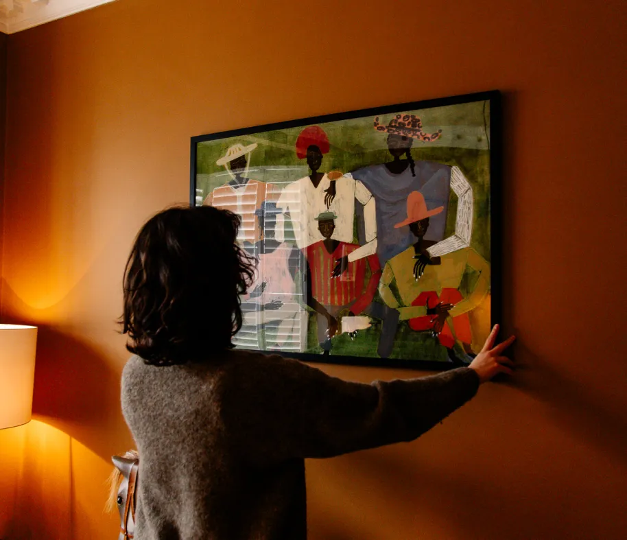
In conversation with... Anna Podlewska
We sat down with Anna, a painter based on Ireland’s west coast, known for her bold colours and abstract forms inspired by architecture and improvisation.

So Anna - tell us about yourself
I am a painter and textile designer. Originally from London, UK, where I trained in Textile Design at The University of Arts London. I then started my career as Print Designer in the apparel industry, working in London, New York and Philadelphia for twelve years before moving to the west cost or Ireland in 2021. Since then I’ve been focussing on my practice as a painter.
I work mostly in oil paint and favour this medium because the pigments are so vibrant. Bold colour is integral to my pieces, which explore abstract forms and interactions between vibrant hues. Some compositions are inspired by architectural structures and play with angular shapes and perspectives. Others are improvisations developed on the canvas and comprised of whimsical shapes.
What sparks the first stroke on a blank canvas?
Before starting work on a canvas I plan a rough composition by layering up photos of paper collages, architecture, previous paintings and other inspirational images. I pick out key shapes to build a rough composition and identify where the highs and lows or colour will be. I use this as an initial plan but the painting always changes or develops in work; each mark, shape or brushstroke on the canvas in made in response to the previous.
How do you decide which colours and shapes to layer next during the painting process?
It’s instinctual really. When I paint a shape in a particular colour I ask myself what’s needed next eg. a pop of complimentary colour? Or something neutral to balance it? Should the shape be large or small to balance the composition?

What draws you to oils as your primary medium, and do you have any techniques or tools you rely on?
I like to use a fairly small colour palette - three or four main hues. In addition I include one or two neutrals in each palette. This grounds and balances the overall combination and also helps the bright hues to pop out.
I’ve studied colour theory and often use hand made colour wheels as a reference. A colour wheel is a circular arrangement of hues organised according to their relationship to each other (see photos from my studio). Looking at a colour on the wheel - you can identify its complimentary colour to help to pop, or a neutral that will help ground it.

Are there particular artists or movements that have inspired your focus on colour and abstraction?
I love the work of Serge Poliakoff and Sonia Delaunay and have learnt a lot from studying their compositions and use of colour. Also Annie Albers for her use of colour theory. The Bauhaus movement and Brutalist architecture.
What do you hope viewers experience or feel when they see your work?
My aim is for the observer to notice something new each time they look at a piece. In the pieces that are architectural such as ‘Brutalist’ I hope they pick up on a new angle or perspective. In the pieces that pure abstract shapes such as ‘Everything Fits As It Should’ I hope the viewer notices a new shape or maybe a new relationship between two shapes that didn’t jump out at them before.

What role do complementary colours play in your work? Are there any combinations you’re particularly drawn to?
I’m working along with Orange at the moment. Its just such a fantastic and versatile colour! It can be bold or soft, warm and nourishing or stark and jarring.
Is there a specific piece of yours that best captures your process or philosophy as an artist?
My favourite recent work is “Everything Fits As it Should”. The colour palette in this is a balance of warm burgundies and earthy greens with pops of vibrant oranges and pinks. In me in invokes a comfortable warm feeling but its also so much fun!

Where do you see your work evolving next—are there new techniques, colours, or forms you’re excited to explore?
I've started painting on raw linen canvas’ recently. These have lots of texture and require you to layer up the paint more. I plan to continue to hone this technique!
Recently I’ve also had the opportunity to paint a couple of murals. Working on such a large scale has been a learning curve, challenging and so much fun! I hope to do more of this too.
Do you have any dream projects or spaces where you’d love to see your art featured?
Such a hard question. The opportunities for grown and development in my work are endless!
"Very happy customer here - shipped & delivered exactly in the promised timeframe, great packaging that protected the art without going overboard. Amazing art selection and no import duties to the EU! I couldn’t be happier, thank you so much GoodMood!! :)"
"Excellent quality prints with colours that really pop. I love the range of Artists that GoodMood has available. Highly recommended!"
"Gorgeous prints, excellent service and communication."
"I'm delighted with my prints, they look fantastic on the wall! The website was a particular highlight, user-friendly and very easy to view products. Speedy and flawless delivery - I'll be back for more prints!"
"Really happy with my new prints from GoodMood - great prices, quick delivery and they look fab!"

4.9 star rating
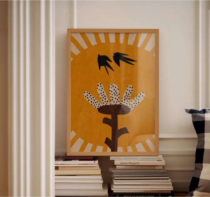
Browse Art by Style
Browse Art by Subject
Browse Art by Medium
All of our paper and frames are FSC certified
We only use eco inks, plastic and acid free
We print and frame globally, locally, to minimise our environmental impact
We only print to order, meaning we have zero waste
Our museum grade, heavyweight paper ensures Giclée printed colours, POP!
We are a community dedicated to supporting independent artists
This website uses cookies to ensure you receive the best possible experience